
Ciri
Visual direction and an online store prototype for an AG925 sterling-silver collection, now in client review.
- Client
- Ciri
- Field
- Silver jewellery
- My role
- Visual direction, UI design, prototype
- Year
- 2026
- Lines
- Sell
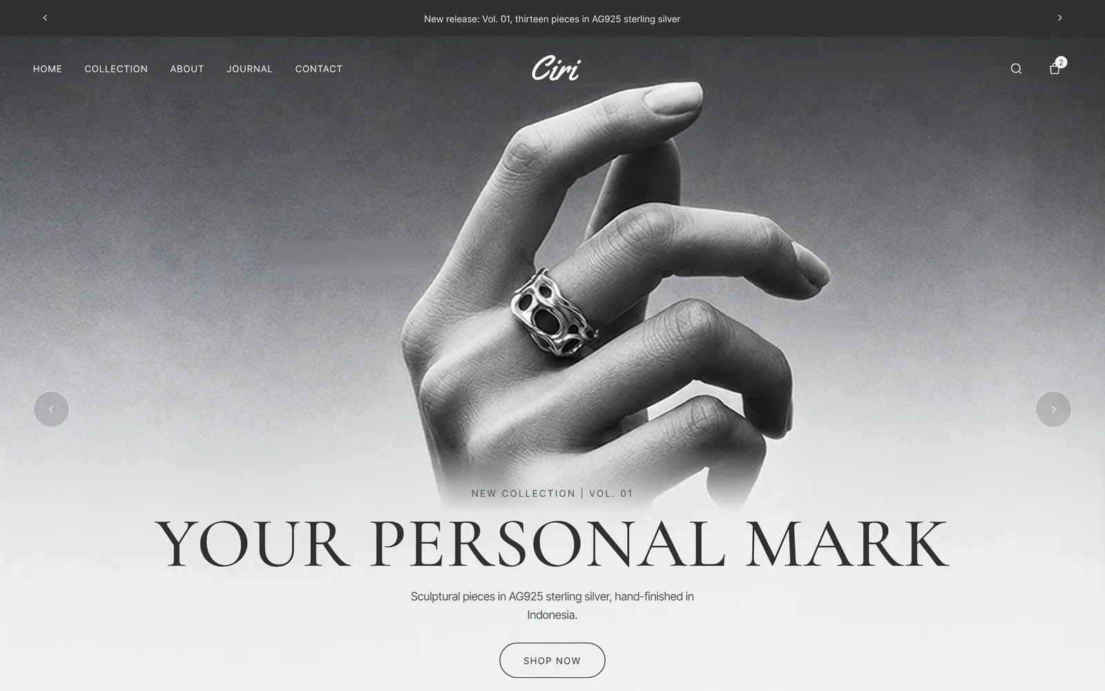
The situation
Ciri sells an AG925 sterling-silver collection: 13 pieces in 8 forms across rings, earrings and necklaces. Silver jewellery sells through its photos, so the store has to give the metal room to shine, not compete with it.
Before anything gets built, the client needs to see and try the store. I handed over a single preview file with 35 clickable pages, each in a desktop and a phone version. The client is reviewing it now, and the store itself hasn't been built yet.
A store you can click through
A visual direction with no accent colour
Graphite type and silver greys with no accent colour at all, so the jewellery photos stand out most. Headings use the classic Cormorant, while body text uses the compact Inter Tight, which reads easily on a phone.
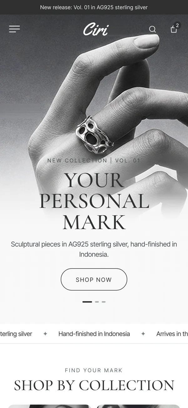
Collection and categories
The collection page lays out all 13 pieces in one grid. Shoppers can pick rings, necklaces or earrings, filter by availability and form, then sort the results.
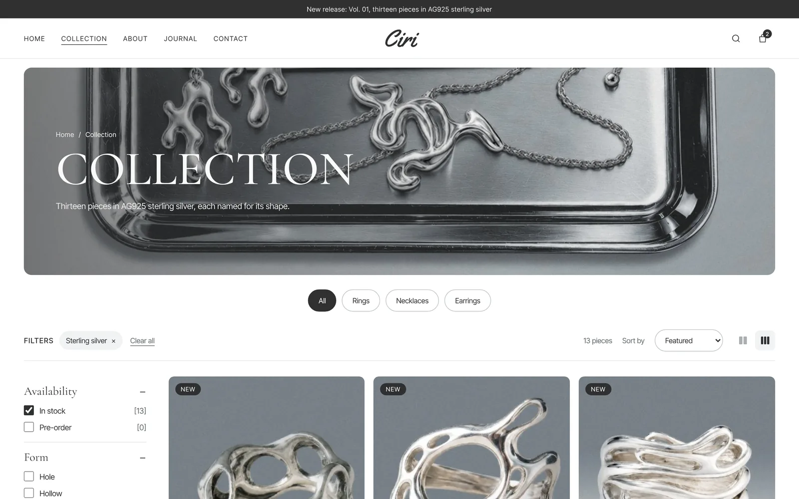
Product pages and the bag
Each piece has its own page with photos, product details and silver care notes. The bag slides open from the side, so shoppers can add items without leaving the page.
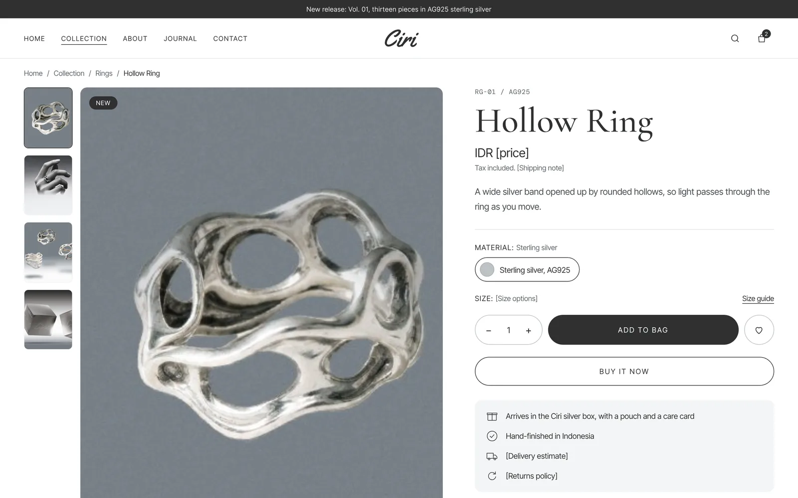
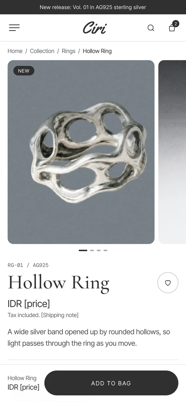
Journal and the full shopping flow
Eight journal articles carry the editorial side of the store. The about, contact, help, account, checkout and order confirmation pages are designed too, so the client can try a purchase from the homepage to the final confirmation.
From visual direction to store
- Set the visual direction: graphite, silver greys, no accent
- Design 35 pages in desktop and phone versions
- Put them together in one clickable preview file
- The client clicks through the shopping flow and leaves notes
- The store gets built once the design is approved
Decisions that protect the business
Prototype before code
The client can click through the whole store before a single line of store code is written. Changing a design at this stage is far cheaper and quicker than changing a finished store.
The silver is the colour
With no accent colour, buttons and links don't compete with the products for attention. The only shine on the page comes from the silver in the photos.
Every page has a phone version
All 35 pages are designed for desktop and phone together, so the client judges both before the build instead of finding phone layout problems after launch.
Care notes on the product page
Silver can tarnish if it's cared for the wrong way. Care notes sit on the product page, so shoppers know how to look after a piece before they buy it.
By the numbers
- 13
- pieces in 8 forms
- 35
- pages, desktop and phone
- 8
- journal articles
- 0
- accent colours, the silver speaks
Built with HTML, CSS and JavaScript as a single preview file, set in Cormorant and Inter Tight.